MyUSFinance Loan Calculator: Your Smart Way to Calculate EMI Instantly (2026 Guide)
Planning to take a personal loan but worried about monthly payments? You're not alone. Over 68% of borrowers struggle to understand how much they'll actually pay each month. That's where the myusfinance loan calculator comes in – your free, instant solution to calculate EMI for personal loan instantly without any hassle. Whether you're comparing loan options or planning your budget, this powerful tool takes the guesswork out of borrowing.
📋 Quick Navigation
📊 What is MyUSFinance Loan Calculator?
The myusfinance loan calculator is an online tool that helps you calculate your EMI (Equated Monthly Installment) before applying for a loan. Think of it as your financial crystal ball – it shows you exactly what to expect before you sign on the dotted line.
This personal finance tools isn't just another calculator. It's designed specifically for American borrowers who want clarity and control over their financial decisions. Whether you're looking at a car loan, mortgage, or personal loan, this tool breaks down complex numbers into simple, actionable insights.

It helps you:
📅 Plan Your Monthly Budget
Know exactly how much you'll pay each month. No surprises, no hidden costs. Just clear numbers that help you manage your cash flow effectively.
🔄 Compare Loan Options
Testing different interest rates and tenures? Our free EMI calculator lets you compare multiple scenarios in seconds, helping you choose the best deal.
🛡️ Avoid Financial Surprises
See the total interest you'll pay over the loan term. This eye-opening feature helps you understand the true cost of borrowing.
⚡ Make Informed Decisions
Armed with accurate data, you can negotiate better terms with lenders or decide if you should borrow at all.
🧮 How EMI is Calculated?
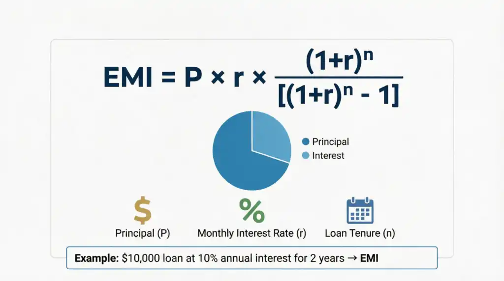
Understanding the math behind your EMI helps you make smarter borrowing decisions. Here's the formula that powers every calculation:
EMI Formula
EMI = [P × r × (1+r)^n] / [(1+r)^n - 1]
Where:
P = Loan amount (Principal)
r = Monthly interest rate (Annual rate ÷ 12 ÷ 100)
n = Loan tenure in months
Breaking It Down:
Let's say you're borrowing $10,000 at 10% annual interest for 2 years. Here's what happens:
- Principal (P): $10,000
- Monthly Rate (r): 10% ÷ 12 = 0.833% or 0.00833
- Tenure (n): 2 years × 12 = 24 months
👉 Don't worry—you don't need to calculate manually. Our loan EMI calculator does it instantly with pinpoint accuracy. Just enter your numbers and get results in milliseconds.
🪜 How to Use This Calculator
Using the myusfinance loan calculator is as easy as ordering coffee. Here's your step-by-step guide:
Step 1: Enter Your Loan Amount
Type in how much you want to borrow. Be realistic – borrow only what you need and can comfortably repay.
Step 2: Add Interest Rate (%)
Input the annual interest rate offered by your lender. If you're shopping around, try different rates to see how they affect your EMI.
Step 3: Select Loan Tenure
Choose your repayment period in months or years. Remember: longer tenure means lower EMI but higher total interest.
Step 4: Click Calculate
Hit the calculate button and watch the magic happen. Your results appear instantly!
🎯 Instantly See:
- Monthly EMI: The exact amount you'll pay every month
- Total Interest: How much extra you'll pay over the loan term
- Total Payable Amount: Principal + Interest = Your total cost
- Amortization Schedule: Year-by-year breakdown of payments
📌 Example EMI Calculation
Let's walk through a real-world scenario to see how this works:
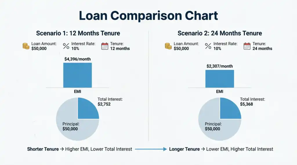
Real-Life Example: Sarah's Personal Loan
Scenario: Sarah needs $50,000 for home renovation. She's been offered a loan at 10% annual interest for 12 months.
Here's what she enters:
- Loan Amount: $50,000
- Interest Rate: 10% annually
- Tenure: 12 months
👉 The tool shows:
- Monthly EMI: ≈ $4,396
- Total Interest: ≈ $2,752
- Total Payment: $52,752
What this means: Sarah will pay $4,396 every month for a year. By the end, she'll have paid $2,752 in interest – the cost of borrowing $50,000.
What If Sarah Chooses a Longer Tenure?
If Sarah extends her loan to 24 months (2 years):
- EMI drops to ≈ $2,307 (more manageable monthly)
- But total interest jumps to ≈ $5,368
- She pays almost double the interest!
This is why using a monthly EMI calculator with interest rate is crucial – it reveals the true cost of different options.
🎯 Benefits of Using This Tool
Why should you use the myusfinance loan calculator instead of guessing or relying on bank representatives? Here's what makes it special:
- Instant & Accurate Results: Get precise calculations in less than a second. No waiting, no approximations.
- No Signup Required: Unlike many financial tools, you don't need to create an account or share your email. Just calculate and go.
- Helps in Financial Planning: See how different loan amounts affect your monthly budget. Plan ahead with confidence.
- Compare Multiple Loan Options: Test different combinations of amount, rate, and tenure to find your sweet spot.
- Completely Free to Use: This free EMI calculator costs you nothing – not a penny. Use it as many times as you need.
- Privacy Protected: Your data stays on your device. We don't store or share your information.
- Works Offline: Once loaded, the calculator works even without internet connection.
- Mobile Optimized: Calculate on your phone, tablet, or desktop – it works perfectly everywhere.
🔍 Why Use This Instead of Manual Calculation?
Let's be honest – calculating EMI manually is like doing long division in the age of smartphones. Sure, you could do it, but why would you?
The Problems with Manual Calculation:
⏰ Time-Consuming
The EMI formula involves exponents and complex math. One calculation can take 5-10 minutes if you're doing it by hand.
❌ Error-Prone
One wrong decimal place and your entire calculation is off. This could lead to serious financial miscalculations.
🔄 Hard to Compare
Want to test 5 different scenarios? That's 50+ minutes of manual work. With our tool, it's 5 clicks.
📊 No Visual Insights
Manual calculations give you numbers, not insights. Our calculator shows charts and breakdowns automatically.
How Our Tool Simplifies Everything:
This tool simplifies everything and gives error-free results in seconds. Plus, you get:
- Visual charts showing principal vs. interest
- Year-by-year amortization schedule
- Instant comparison between scenarios
- Mobile-friendly interface
- Zero learning curve
📱 Mobile-Friendly & Fast Tool
In today's world, you need financial tools that work as hard as you do. The myusfinance loan calculator is built for modern life:
📲 Works Smoothly on All Devices
Whether you're on an iPhone, Android, iPad, or laptop, the calculator adapts perfectly to your screen size.
⚡ Lightweight and Fast Loading
No bloated code, no slow loading times. The page loads in under 2 seconds, even on 3G connections.
🚫 No Installation Required
Forget downloading apps that eat up your storage. This web-based tool works instantly in your browser.
💾 Bookmark for Quick Access
Save it to your phone's home screen for one-tap access whenever you need to calculate EMI for personal loan instantly.
Perfect For:
- First-time borrowers researching loan options
- Homebuyers comparing mortgage rates
- Car shoppers calculating auto loan payments
- Students planning education loans
- Anyone wanting to understand their debt better
Ready to Calculate Your EMI?
Stop guessing. Start planning. Use our personal loan EMI calculator online today and take control of your financial future.
Calculate My EMI Now – It's Free!❓ Frequently Asked Questions
The myusfinance loan calculator is a free online tool that calculates your Equated Monthly Installment (EMI) for any type of loan. You simply enter three pieces of information: loan amount, interest rate, and loan tenure. The calculator instantly processes this data using the standard EMI formula and shows you your monthly payment, total interest, and total amount payable. It's designed to help borrowers make informed decisions before taking out a loan.
Yes, absolutely! Our loan EMI calculator is 100% free with no hidden charges. You can use it as many times as you want without creating an account, providing personal information, or paying a single cent. We believe everyone deserves access to quality personal finance tools without financial barriers.
Our calculator uses the standard mathematical EMI formula used by banks and financial institutions worldwide. The results are highly accurate and match what lenders will quote you. However, actual EMIs may vary slightly due to processing fees, prepayment charges, or other lender-specific terms. Always confirm final numbers with your lender before signing any agreement.
Yes! This versatile tool works for all types of loans including personal loans, home loans (mortgages), car loans, education loans, business loans, and even debt consolidation loans. The EMI calculation formula remains the same regardless of loan type – only the amount, interest rate, and tenure change.
Changing the loan tenure has a significant impact on your EMI and total interest. A longer tenure reduces your monthly EMI but increases the total interest you'll pay over the loan's life. Conversely, a shorter tenure means higher monthly payments but less total interest. Use the calculator to test different tenures and find the balance that works for your budget.
The basic EMI calculation shows only principal and interest. Processing fees, documentation charges, insurance, and other lender fees are typically not included in the EMI. These are usually one-time charges paid upfront or added to the loan amount. Always ask your lender about all applicable fees to understand the complete cost of borrowing.
Absolutely! This is one of the best ways to use the calculator. Enter the loan details from Bank A, note the EMI, then clear and enter details from Bank B. Compare the EMIs and total interest to see which offer is better. Don't just look at the EMI – also consider the total interest and any additional fees each bank charges.
Your privacy is our top priority. This calculator runs entirely in your browser – we don't collect, store, or share any of the information you enter. No email registration, no phone numbers, no tracking. You can calculate your EMI with complete confidence and anonymity.
Small differences can occur due to several factors: rounding methods (some banks round up to the nearest dollar), different day-count conventions, processing fees added to the principal, or floating vs. fixed interest rates. If there's a significant difference, ask your lender to explain their calculation method.
While the basic calculator shows standard EMI, many versions include a prepayment feature. By entering an extra monthly payment amount, you can see how much interest you'll save and how much faster you'll pay off the loan. Even small prepayments can save thousands in interest over the loan term.
Most personal loans use the reducing balance method (which our calculator uses), where interest is calculated on the outstanding principal. Flat rate loans calculate interest on the original loan amount throughout the tenure, making them more expensive. Always confirm which method your lender uses – the EMI might look similar, but the total cost can differ significantly.
You have three main options: 1) Extend the loan tenure (lowers EMI but increases total interest), 2) Negotiate a lower interest rate with your lender or shop around for better rates, or 3) Make a larger down payment to reduce the principal amount. Use the calculator to see how each option affects your monthly payment.
Not necessarily! A lower EMI often means a longer tenure, which means you'll pay more total interest. For example, a $10,000 loan at 10% for 2 years has an EMI of $461 and total interest of $1,074. Extend it to 5 years, and EMI drops to $212, but total interest jumps to $2,748. Always consider the total cost, not just the monthly payment.
Most modern browsers allow you to print the page or save it as a PDF. Simply use Ctrl+P (or Cmd+P on Mac) and choose "Save as PDF" to keep a record of your calculations. This is helpful when comparing multiple loan offers or discussing options with a financial advisor.
Yes, the calculator works perfectly for business loans, equipment financing, and commercial real estate loans. The EMI calculation formula is the same regardless of whether you're borrowing for personal or business purposes. Just enter your business loan amount, interest rate, and desired repayment period to get instant results.
If the EMI seems too high, don't panic. Try these strategies: 1) Increase the loan tenure to lower monthly payments, 2) Reduce the loan amount if possible, 3) Look for lenders offering lower interest rates, 4) Consider making a larger down payment, or 5) Improve your credit score to qualify for better rates. Never stretch your budget too thin – a comfortable EMI is crucial for financial health.
Use it whenever you're considering a loan – before applying, when comparing offers, or even after taking a loan to plan prepayments. Financial situations change, and rates fluctuate. Regular use helps you stay informed and make the best decisions for your circumstances. Bookmark this free EMI calculator for quick access whenever you need it.